Pages

Jun 30, 2013

Samsung Galaxy S4 cases by Urban Armor Gear hands-on

As one of the premier designers and manufacturers of rugged smartphone cases, Urban Armor Gear (UAG) has released a quartet of cases for the Samsung Galaxy S4. Available in four different colors, the covers feature a patented design with a hard outer shell and soft, impact-resistant core.
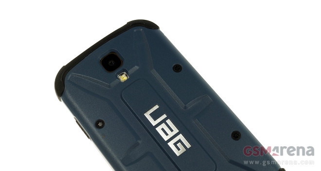
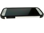
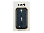
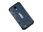
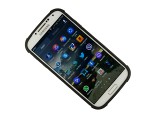
I spent some quality time with the UAG Aero and Navigator cases for the Samsung Galaxy S4. Finished in dark blue and white respectively, the duo features the same design, construction and functionality. Hit the break to learn more about the Urban Armor Gear offerings!

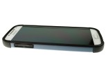
Being proper rugged cases, the UAG offerings for the Samsung Galaxy S4 cover tightly all edges of the smartphone, as well as its display by extending above it by about a millimeter. There’s a screen protector and cleaning cloth included in the retail package.
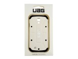
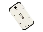
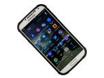
UAG Aero and Navigator Galaxy S4 cases live photos

The Samsung Galaxy S4 cases by UAG look and feel great in person. The overall finish is superb, so even the pickiest users will be hard-pressed to find anything to frown at. The profile of the covers is surprisingly thin, considering their rugged nature.

Ergonomics are impressive. The Galaxy S4’s side buttons are covered, yet light to use. All ports are open and easy to access. The same goes for the dedicated microphones on the Galaxy S4.

Furthermore, UAG’s Galaxy S4 cases also feature a design, which prevents flash glare from the camera. The task has been accomplished by slightly protruding the enclosure around the flash on the side of the camera unit.

As far as rugged cases go, Urban Armor Gear’s products should be on top of everyone’s shopping list if their budget allows. The cases are rugged, yet slim and attractive looking. Their toughness stops short from water resistance, but it offers plenty to cover the needs of just about every user out there.


Source : blog[dot]gsmarena[dot]com
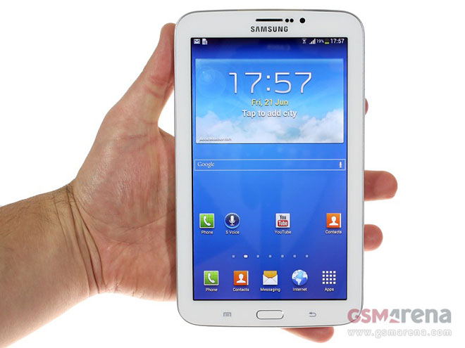
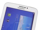
Samsung Galaxy Tab 3 7.0 stops by, poses for the camera

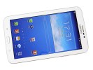
The budget 7″ Android tablet market has been enjoying quite a lot of attention from a number of manufacturers and the latest device to join in on the fun is a refresh of one of the very first small tablets – the Samsung Galaxy Tab 3 7.0.

The third-generation of 7″ Galaxy Tab has just hit the shelves and it feels nicely polished and put together. It’s not quite the performance champion, sporting the little known Maxwell chipset with 1.2GHz dual-core Cortex-A9 CPU, 1GB of RAM and 8GB of internal storage, which fortunately is expandable by a maximum of 64GB.

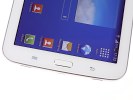
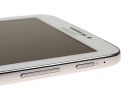
The design of the Samsung Galaxy Tab 3 7.0, unsurprisingly, is heavily inspired by the Galaxy S4 and features a physical Home button with capacitive menu and back keys on each of its sides. On the left side there are the SIM card and microSD card slot, while on the right we find the volume rocker, power button as well as an IR blaster, which our prototype didn’t yet have.

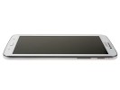
Built entirely out of plastic, the Galaxy Tab 3 7.0 is quite prone to fingerprints, so it’d need an occasional cleaning to maintain its looks. On the positive side, Samsung has made the bezels thinner than the previous generation 7″ Galaxy Tab. It’s lighter as well weighing 300 grams, while measuring 110.9 x 187.9 x 9.9mm.

At the back, there’s a 3MP snapper sans LED flash, but that’s not such a drawback, since the camera on the Galaxy Tab 3 7.0 should be used only as a last resort. However, at the front, there’s a 1.3MP one, that’s going to be great for video chatting sessions. Next to it are located the proximity and ambient sensors.

Unfortunately, the display is nothing to write home about. It’s a TFT unit with an uninspiring resolution of WSVGA (1024 x 600) and is basically the same as the previous generation of the slate.

We’ve thrown in a quick hands-on video to get wet your appetite until we finish working on our extensive


Source : blog[dot]gsmarena[dot]com

Wireless Charging Plate can charge both your Lumia and your toothbrush

Wireless charging is slowly gaining traction with smartphone makers. But here’s an unexpected use – it can also help with your dental hygiene.

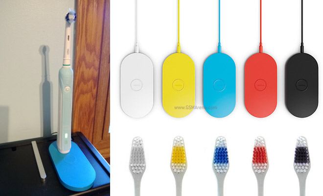
No, really – inquisitive Reddit user el_n00bo_loco decided to put his electric toothbrush on top of a Nokia Wireless Charging Plate (like the one we reviewed the other day).

It’s good to see that a £55 / €68 charging gadget can be used for more than just charging your phone.

The Charging Plate uses the Qi standard, which is quite popular – it’s used by other phones that support wireless charging along with third-party add-ons for those that don’t, but also for things like game console controllers, wireless speakers and so on.


Source : blog[dot]gsmarena[dot]com

Vine app now available on Kindle Fire

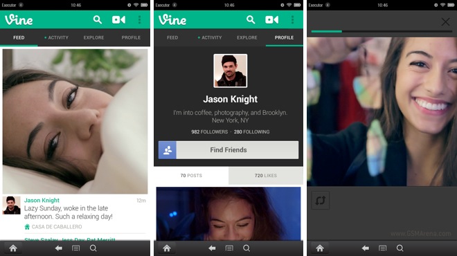
After releasing on the Google Play Store recently, the Vine app is now available on Kindle Fire. The app requires Android 4.0 and above, so can work on every version of the Kindle Fire, except for the very first model.

For those who are not aware, Vine is a new social networking service for sharing short, six second videos. It used to be known as the Instagram of videos, until recently when Instagram itself added support for videos. The Vine app for Kindle Fire is the first tablet version of the app, as it is only available on smartphones on iOS and Android. Having said that, the UI is similar to the Play Store version of the app and not really optimized for the big screen as such.

The launch of the Vine app for Kindle Fire comes as a surprise, since the app took over four months to arrive on Android after its iOS debut. With Instagram now quickly becoming the preferred choice for sharing videos, Vine seems to be more than willing to expand to other platforms. Who knows, we may see a Windows Phone version of Vine shortly.


Source : blog[dot]gsmarena[dot]com

Samsung Galaxy Tab 3 8.0 hits our office, hands-on video is inside

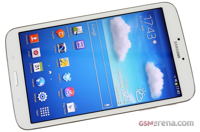
Samsung Galaxy Tab 3 8.0 is arguably the most interesting of the latest generation Samsung slates. It’s an affordable dual-core tablet running on the latest Android 4.2 Jelly Bean OS and the 1280 x 800 pixel resolution isn’t as big an issue as it is on the 10″ screen of the Galaxy Tab 3 8.0. Samsung’s proprietary TouchWiz is on top, of course, full of useful apps and services.

The SamsungGalaxy Tab 3 8.0 is a thinner, lighter and S-Pen-less version of the Galaxy Note 8.0. It’s cheaper too, so you may be willing to forgive the less capable chipset.

And even though the Galaxy Tab 3 8.0 comes two processor cores short of the Galaxy Note 8.0, it still handles the Android OS and even the heavy apps without hiccups. We’ve prepared a short hands-on video for you to check out.


Source : blog[dot]gsmarena[dot]com

Jun 29, 2013

UK consumers say the Galaxy S4 is the fastest smartphone with best battery life

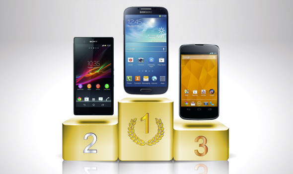
The Samsung Galaxy S4 has won two award from UK consumer research company Which?. It found that Samsung’s Android flagship is not only the fastest smartphone currently on sale, but also the one with the best battery life.

Which? determined this by running the Geekbench 2 benchmark on selected smartphones. The Galaxy S4 got on top with 3188 points with the HTC One sitting in the second place with 2798. We also confirm this in our own benchmark results of the Galaxy S4, which you can check in our extensive review of the smartphone.

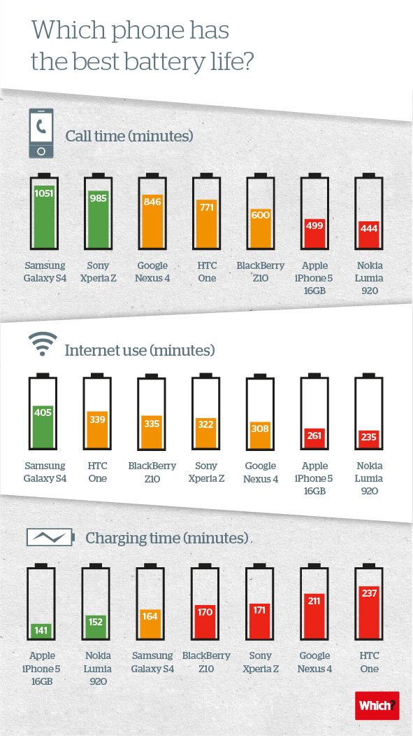
As far as battery test, the Galaxy S4 wins the gold as well with best call time and internet usage results. The Which? consumer research company uses its own phone network simulator, which ensures that the signal strength is the same every time.

And here’s a cool mini-infographic showing the battery performance of the tested devices.


Source : blog[dot]gsmarena[dot]com

Microsoft releases SkyDrive Pro apps for Windows 8 and iOS

Couple of weeks ago, Microsoft released Office Mobile app for Office 365 users on iOS. Now Microsoft has released a new app for iOS as well as Windows 8 for SkyDrive Pro users.

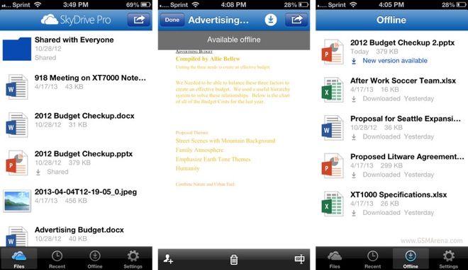
Like the one before, the SkyDrive Pro app is only for Office 365 users. You sign in using your account details and then you will be able to access, view and upload documents in your SkyDrive Pro folder. You can download these files for offline viewing, create new folders and share your content with others.

The iOS and Windows 8 version of the SkyDrive Pro app are now on their respective store and can be downloaded from the respective links below.


Source : blog[dot]gsmarena[dot]com

App of the Week: Springpad

By Mary Godfrey

Jun 29, 2013 6:17am

ht springpad mi 130728 33x16 608 App of the Week: Springpad

App Name: Springpad

Price: Free

Available Platforms: iOS, Android, Kindle, Chrome and Desktop

What does this app do?:  When it comes to keeping track of the things we want to remember there are any number of ways to go about it. From calendar reminders to personal assistants to apps–even doing it the old fashioned way by scribbling notes down on a piece of paper–people need a method by which to stay organized.

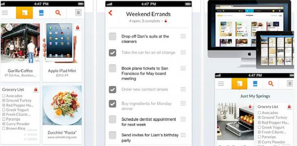
Springpad is one such way to go about this feat.  The productivity app allows users to copy, save and share items from a variety of categories such as products you want buy, links you want to keep, and checklists you want to stay on top of and even recipes you hope to prepare. Tap the yellow “+” and begin adding items to a notebook, like Epicurious.com’s recipe for “Little Apricot Cakes,” or the movie “Anchorman: The Legend Continues.” The items will appear in a collage-like layout on your device reminiscent of Pinterest’s visually driven app. Springpad, however, attempts to take organizing all of that information a step further;  to help you stay on top of your “springs,” the app will create a shopping list of ingredients to actually make those apricot cakes, for example, or notify you when the movie you flagged is available in Netflix.

The app’s features extend beyond just the ability to make product wish-lists. For the to-do driven list maker, Springpad provides the ability to create task and check lists as well create notebooks, such as “Team Project for Work,” and share them with others to collaborate on projects.

Is it easy to install?: Yes. Download Springpad, create a login, and go.

Should I try it?: Springpad will remind users of Pinterest in that it caters to those who rely on images to help them stay organized, and the concept of creating and sharing “notebooks” seems a lot like Evernote. However, through it’s easy-to-use layout and effort to provide you with relevant data about items you’ve saved, such as when that book you’ve been dying to read goes on sale, Springpad sets itself apart making it a nice option for those looking for an intelligent way to stay organized.


Source : abcnews[dot]go[dot]com

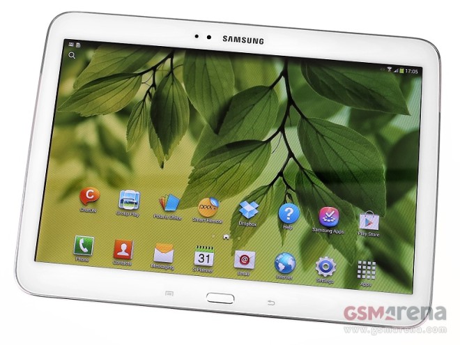
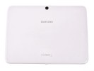
The Samsung Galaxy Tab 3 10.1 drops in for a hands-on

The Samsung Galaxy Tab 3 10.1 is the largest member of the new Tab 3 lineup, and it has stopped by our studio for a quick hands-on before it gets whisked away for a full review.

The Galaxy Tab 3 10.1 is one the first Samsung tablets to run on Intel’s new Atom Z2560 chipset, and we’re eager to see how it fares under Samsung’s Android Jelly Bean build with TouchWiz optimizations.

The Atom processor is of the dual-core 1.6GHz variety, and is joined by 16/32GB of internal memory, 1 GB of RAM, and a 3 MP camera capable of 720p video recording in the list of highlights. The 10.1-inch display stretches the 1280 x 800 pixel resolution rather thin, but otherwise the image quality is rather nice with excellent contrast, bright colors, and good viewing angles.


Samsung Galaxy Tab 3 10.1 studio pics

The tablet runs Android 4.2.2 Jelly Bean with all the usual TouchWiz optimizations from Samsung. Check out this brief hands-on video we’ve shot:


Source : blog[dot]gsmarena[dot]com

Jun 28, 2013

NRDC List: Is Your Beach Fine or Filthy?

By ABC News

Jun 28, 2013 5:43pm
nc gulf state park pavilion ll 130628 33x16 608 NRDC List: Is Your Beach Fine or Filthy?

Franklin Viola/Danita Delimont Photography/Newscom

The annual list of the cleanest — and dirtiest — beaches is out.

Before you head to the shore, click here to see how your beach ranks.

The Natural Resources Defense Council examined the water quality at more than 3,000 U.S. beaches along the Atlantic and Pacific Oceans, the Gulf of Mexico and the Great Lakes. It then rated the 200 most popular sites.

The council, which has been reporting on the state of U.S. beaches for the last 23 years, found that in 2012, those sandy, sunny vacation spots had more than 20,000 closing and advisory days — for the third straight year.

According to the council, “the largest known contributor to beach closings or health advisory days was stormwater pollution.”

After analyzing the violation rates and practices regarding bacteria testing and public safety at the 200 popular U.S. beaches, the council awarded 13 with the highest rank of five stars.

Those beaches included Alabama’s Gulf State Park Pavilion, California’s Newport Beach, Rehoboth Beach in Delaware and Minnesota’s Lafayette Community Club.


Source : abcnews[dot]go[dot]com

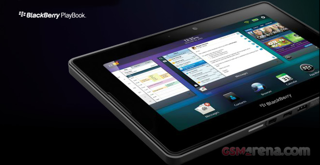
U-Turn: BlackBerry PlayBook won’t get BlackBerry 10 update

Today is certainly not a good day for the BlackBerry fans. Earlier CEO Thorsten Heins reported disappointing earnings results for the last quarter. The company did manage to increase its revenue, but it didn’t meet profit expectations, in fact its operating loss is $84 million. Because of the bad financial report the company’s stock tumbled down over 25% at time of writing.

During the financial results conference call BlackBerry delivered another portion of bad news – there will not be BlackBerry 10 update for the PlayBook slates.

Back when BlackBerry 10 was announced, CEO Thorsten Heins promised that the existing PlayBook tablets will get to enjoy the latest version of the platform. There was no explanation for the change of heart, but we bet this is the first of many steps aiming to reduce the company’s operating costs.


Source : blog[dot]gsmarena[dot]com

Google Camera Backpack to Be Lent to Others to Map the World

Jun 28, 2013 12:56pm
ht google trekker kb 130628 33x16 608 Google Camera Backpack to Be Lent to Others to Map the World

Credit: Google

Last year Google started getting Street View images of remote areas of the world not with its cars or trike, but with a contraption called the Trekker. The Trekker is a giant backpack with a mounted camera that pairs with an Android phone. It takes photos as you walk through a desert or a mountain and Google then puts them together  to give you those real-life images in its maps.

Google employees have been using the Trekker to get images of the Grand Canyon, but it’s now planning to allow others to put on the 35-pound backpack. The company announced late Thursday a pilot program that will allow third-party organizations to borrow the contraption and contribute images to Google Maps.

“For the first time ever, this program will enable organizations to use our camera equipment to collect 360-degree photos of the places they know best — helping us make Google Maps more comprehensive and useful for all,” Google’s Street View program manager Deanna Yick wrote in a blog post. “This program is part of our ongoing effort to make it possible for anyone to contribute to Google Maps.”

Google Takes You to the Burj Khalifa, World’s Tallest Building

The company is already working with the Hawaii Visitors and Convention Bureau (HVCB) to get beautiful images from Hawaii Volcanoes National Park, Mauna Loa Observatory, Onomea Bay  and the Pololu Valley. Once those are taken, Google will then stitch the photos together to create 360-degree interactive images and put them in Google Maps so you can visit the islands right from your home.

Google recently updated its Maps applications for the web and for Android phones. The new Maps version for the web is still new and requires you request an invitation to test it out. It provides a more immersive Maps experience with new features, including reviews and traffic data. Google also recently bought the popular traffic app Waze.

Google is now accepting applications from other groups that might be interested in borrowing the Trekker. You can apply here. 


Source : abcnews[dot]go[dot]com

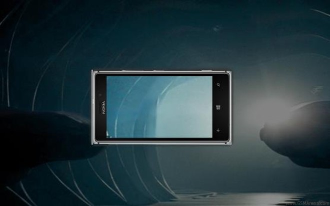
Nokia films European Man of Steel premiere with Lumia 925

Don’t worry – no spoilers here! If you haven’t seen Man of Steel yet you should know that Nokia had arranged some product placement deals with the movie producers and has even arranged to have a first-class ticket to the European premiere of the movie.

Along with starts Henry Cavill, Russell Crowe and Kevin Costner comes the Nokia Lumia 925 and, more importantly its 8.7 MP PureView sensor. Nokia made a coverage video of the premiere using only Nokia Lumia 925s (a lot of them) – check it out.

The video is quite nice although there has obviously been some quite some post-processing so we are not sure how much of the credit should go to the Lumia 925.

You can also download the Man of Steel app, share photos to show the way you see the world as the Man of Steel and you can win tickets to the movie.


Source : blog[dot]gsmarena[dot]com
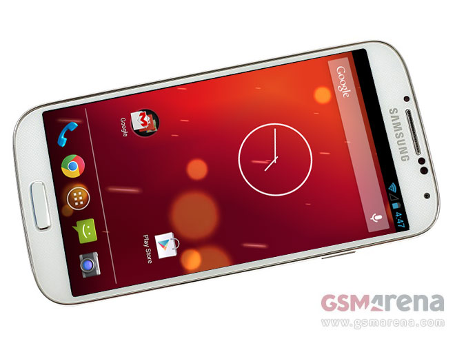
We take the Samsung Galaxy S4 Android 4.3 ROM for a spin, here’s the video

When Google’s Hugo Barra announced at the Google I/O 2013 that the Samsung Galaxy S4 will be offered directly from the Play Store as a “Google Play Edition” device running stock Android, many people got really excited. Later on, HTC also jumped on the bandwagon with the HTC One, giving you a choice between two excellently spec’d smartphones that offer the Nexus experience.

As planned, the devices went on sale on June 26 and almost immediately, an alleged Galaxy S4 I9505G unit was discovered that runs on the yet unannounced Android 4.3 Jelly Bean instead of the official Android 4.2.2 Jelly Bean. Shortly after, a ROM that any regular Galaxy S4 owner with a Snapdragon 600 (yes, including the regular TouchWiz version) can flash popped up.

And here we are today, presenting you a Samsung Galaxy S4 (I9505) turned into a Samsung Galaxy S4 Google Play Edition (I9505G) running the leaked ROM 4.3. So, how does it feel and what’s new?

Right after you power on the stock Android-loving Galaxy S4, you notice the new Android boot animation with the Google logo prominently flashing. Then, you’re greeted with a special-made live wallpaper for the Google Play Edition duo dubbed Sun Beam. It’s essentially the same as the Phase Beam, but is done in fire red. Welcome to stock Android 4.3 territory.

Depending on where you come from (TouchWiz 4.2 or vanilla Android 4.2) the user interface can feel either completely different or virtually unchanged. There are five homescreen panes that can’t be deleted nor moved like on the rest of the Nexus family. The notification drawer still has a shortcut for the quick settings and the bottom dock holds four customizable app shortcuts and the app drawer icon. In a word – stock Android user interface.

However, there are a few changes here and there. Google Keep for example now comes preloaded, as does Google Hangouts (replacing Google Talk). Google Now is now at version 2.6.7.721924 and as now comes with support for two new types of cards – TV and Offers.


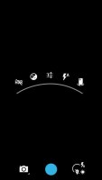
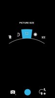
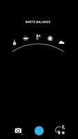
Android 4.3 new camera UI

The other notable change is the new camera interface, which is much more usable. When you tap on the screen to change the settings, there’s a new arch above your finger that shows the quick settings – HDR, Exposure, Flash and jump to the front-facing camera. There’s a settings button, too, which shows more options in a similarly visual fashion.

We’ve made a hands-on video of the Samsung Galaxy S4 Google Play edition running Android 4.3 Jelly Bean. Check it out below.

It’s not known at this point if this leaked Android 4.3 that’s running on our Galaxy S4 is even real – it might be an elaborate prank by a skillful developer who fused the leaked camera and gallery apps to the regular 4.2 ROM of the Galaxy S4 Nexus edition and modded the about screen to say 4.3. Or it might be targeted at OEMs to give them time to prepare their custom Android builds with the latest APIs.


Source : blog[dot]gsmarena[dot]com
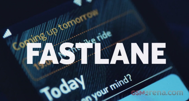
New Nokia Asha promo video focuses on Fastlane

Nokia Asha 501 is the first phone running on the new Nokia Asha software platform and it has just got its proper market release.

The major overhaul of the Asha platform focuses around the so-called Fastlane, which is why the latest promo video revolves around it. The Fastlane keeps track of all your recent activity, opened apps go there, along with contacts you’ve called, calendar events (birthdays, to-dos) and social network posts.

Nokia’s putting quite a lot of effort in the PR campaign of the Asha 501, and it seems that the company may have bigger plans for the Asha lineup than initially expected.


Source : blog[dot]gsmarena[dot]com
Google issues a small update for Gmail on Android, brings back the delete button

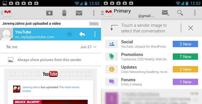
The last update Google made to Gmail for Android was quite substantial and included a lot of user interface changes. One of them was the removal of the Delete button, which caused a hurricane of negative feedback. Today, Google has responded by bringing back the Delete button in a small update for its mail client on Android.

Other than that, the latest version of the Gmail (v4.5.2) includes an undisclosed number of bugfixes as well as the feature to select multiple emails by tapping on their sender’s photo.

Before the update, you had to go in the Settings menu and manually bring up the Delete button. Now, it’s sitting next to the Archive button by default. Follow the source link below to visit the Gmail app on the Google Play Store website and push the update to your smartphone.


Source : blog[dot]gsmarena[dot]com
Nokia Wireless Charging Plate and Fatboy Pillow review

Nokia was among the first manufacturers to include Wireless Charging tech into its smartphones and has a rather cool line of Wireless Charging accessories. We have two of them here at HQ and they work together nicely to carry out their out-the-way no-wires-needed assignments with style.

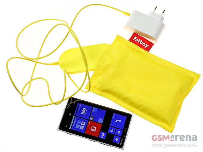
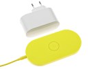
The Wireless Charging Plate and Fatboy-made Wireless Charging Pillow go very well together. The Wireless Charging Plate is the soul of the operation but it you want to encompass your handset in a lavish pillow you can put the plate inside the Wireless Charging Pillow and just drop the phone on it without worrying it will get scuffed or scratched.

The Wireless Charging Plate retails for about £55 or €68 but if you want it bundled with the Fatboy Pillow you’ll need to shell out around £80 or €100. That’s not a modest asking price for what’s essentially a charger with a tiny pillow but a lot of design an appeal have gone into making both accessories.

Design and ergonomics

Both accessories sport a bright yellow paintjob but you could also get them in Cyan, Red, White and the more cultivated Black. And although both are specifically tailored to Nokia’s Lumia range of devices we found them to work just as well with any other Wireless Charging-enabled device, for instance the LG Nexus 4.

The Nokia Wireless Charging Plate weighs 93 grams, which is more than acceptable for an accessory you’re not likely to lug around that much.


The Wireless Charging Plate and Pillow by Nokia

The Wireless Charging Plate is compact and when nestled under the Lumia 920 can almost disappear. When coupled with the Wireless Charging Pillow it is far easier to spot and the immediate benefit is the additional room you get to place your device. The Nokia Wireless Charging Plate gives you room to maneuver your phone while charging – a couple of centimeters won’t disconnect the phone like it did with the Samsung Galaxy S4′s accessory.

Samsung chose to incorporate Wireless Charging technology in its Galaxy S4 smartphone via an additional back cover and a similar, if not as compact or minimalist, design. Nokia, on the other hand, have different approaches for their devices. The Lumia 920 has wireless charging built right in, the Lumia 820 needs to have its battery cover replaced, while the Lumia 720 needs an extra clip-on accessory.

The Nokia Lumia 920 has the added heft but once you place the phone on the accessory you forget about the weight and can easily get used to it thanks to the benefit of not having A/C adapters lying around. The Nokia Wireless Charging Plate comes with its own 2.5 mm charging connector and a long cable (1.8 meters to be exact) but if you can get it out of the way behind some furniture what you’re left with is a minimal accessory on your desk, which can charge your device with ease.

Charging times – this one’s for the win

So let’s check out the numbers and see if the Plate is better than the conventional cable charging.

The Wireless Charging Plate actually did a good job of charging the Lumia 920 from 0% all the way up to full. It completed the task in exactly 2 hours and 40 minutes, which is more than reasonable, especially considering that Samsung’s Wireless Charging Pad took an extra 1:10 hours to do the same to the Galaxy S4. But let’s not point any fingers here as the Samsung flagship does have an extra 600 mAh on its battery compared to the Lumia 920.

The Plate has an output of 750 mA compared to the 1 A of the conventional Nokia A/C adapter that comes in the Lumia 920 retail box. So the microUSB charger should do a significantly faster job of charging the Lumia 920.

Well it did, in a way. The microUSB carger got the Lumia 920 from 0% to 100% in a minute over 2 hours. That’s a whole 39 minutes faster than the Wireless Charging Plate.


Nokia Lumia 920 charging times

Lower is better

  • Wireless Charging Plate

    2:40
  • MicroUSB wall charger

    2:01

Final words


Source : blog[dot]gsmarena[dot]com
Your Pets Are Responsible For $3B in Gadget Damage

By Jon M. Chang

Jun 28, 2013 6:00am
ht White Dog electronics kb 130627 33x16 608 Your Pets Are Responsible For $3B in Gadget Damage

Credit: SquareTrade

Do you have a cracked iPhone screen because it fell on the sidewalk? Did you accidentally drop it in the toilet? Maybe your accident-prone self should have bought some insurance, or at the very least a protective covering.

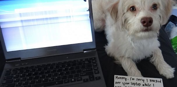
But do you have a cat or dog? If so, you might have more to worry about than your own clumsiness breaking your stuff. A new survey conducted by the SquareTrade insurance company suggests that our four-legged friends are responsible for the destruction of over 8 million devices, totaling more than $3 billion in repair and replacement costs.

Ty Shay, the chief marketing officer for SquareTrade, said that the inspiration behind the survey came from the various types of claims SquareTrade got from its own customers. “We were getting a lot of calls from customers with broken devices saying, ‘My dog chewed my tablet,’ or ‘My cat knocked my soda onto my laptop.’ We found that almost 1 in 5 pet owners have had this problem,” Shay told ABC News.

Some of the survey’s observations seem obvious. Smartphones top the list of gadgets to break, accounting for approximately 30 percent of all reported accidents. Dogs are twice as likely to cause an accident than cats. Two thirds of the accidents occur when the pets are left unattended.

ht Grey Cat photo kb 130627 33x16 608 Your Pets Are Responsible For $3B in Gadget Damage

But there are also some subtle differences among pets that can ultimately determine whether your electronics will make it in the long run, such as:

  • Male pets were 50 percent more likely to damage the devices than female pets.
  • Overweight pets were 72 percent more likely to be involved in damaging a device.
  • People that allowed their pet to sleep in the same bed or ride in their lap while driving were two to three times more likely to have a problem with their gadgets that could be traced back to their pet.

Pet owners need not abandon all hope though. SquareTrade offers some suggestions to keep your electronics working despite your chaos-causing companions. The company’s blog suggests putting the devices in areas out of their reach and avoid putting them near exposed liquids.

It also suggests giving your pet attention and exercise so that they’ll be less interested in your gadgets. Not suggested? Getting your pets their own gadgets.


Source : abcnews[dot]go[dot]com

DivvyUp is a Windows Phone 8 exclusive app for effortless bill splitting

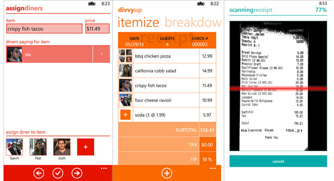
Splitting the bills when out for a dinner with friends or colleagues is always an irksome task which includes passing the receipt multiple times around until everything is cleared out. Now, there’s an app for that. It’s called DivvyUp and is exclusive for Windows Phone 8.

Just snap a photo of the receipt and scan it with DivvyUp. It features Optical Character Recognition to read through the receipt and then assign each item to the person who ordered it. The app comes with some other handy features such as auto-round feature to round each item to a whole-dollar. more features include a tip calculator and quick split in the case everyone wants to share the bill and pay equally.

There’s also a premium version of the app, which costs $0.99. It features the aforementioned OCR feature, and further allows you to customize the look of the app and share breakdown summary.

To download the free verison of DivvyUp, just hit the source link below.


Source : blog[dot]gsmarena[dot]com
Anti-Social Media? This App Tells You Where Your Friends Won’t Be

By Stephanie Mendez

Jun 27, 2013 7:00am
HT hell is other people ll 130626 33x16 608 Anti Social Media? This App Tells You Where Your Friends Wont Be

Credit: Scott Garner

Is the concept of “anti-social media” possible? One graduate student at New York University thinks so and is quickly realizing that other people agree.

“Hell Is Other People” is an experimental Web app that utilizes FourSquare to track check-ins made by friends to determine the best possible routes and areas to avoid them. The experimental anti-social media app was created by Scott Garner, a master’s degree candidate in the interactive telecommunications program at NYU.

“The key to the idea started when I moved to New York for grad school,” Garner said. “It was overwhelming for me to be around so many people in the city, and social anxiety was at the top of my mind at the time.”

Garner also got the idea from a presentation FourSquare co-founder Dennis Crowley made about FourSquare’s early beginnings.

“[Crowley] was a student who wanted to party and started working on this app to find out what bars everyone was hanging out at,” Garner said. “Well, what about the students who don’t want to party all the time and don’t want to go to bars all the time? What can you do to avoid people by using technology?”

The Web app is simple to use. First, a person connects his or her FourSquare account through “Hell is Other People.” Then, the Web app conjures up an avoidance map. The map contains orange and green points. Orange points indicate check-ins by other users, and green points represent “optimally distanced safe zones,” as suggested by the app.

The experimental project initially began for a class final at NYU.

NYU adjunct faculty member James George said his final assignment, “Let Go,” required students to create a system that enabled individuals to behave a certain way.

“I thought it was an amazing interpretation of that idea,” George said. “I think Scott was resistant to doing group projects throughout the class. He was like ‘No, I don’t want to rely on other people.’ He was able to turn that personal anxiety and channel it into the concept of that piece.”

The thought of an “anti-social media” app may seem ironic, but Garner said the initiative isn’t as ridiculous as it seems.

“In some ways, social media and online media are kind of anti-social in that you’re interacting in a virtual space,” he said. “Some people retreat to Facebook in place of personal interaction. It’s something I’m trying to explore.”

In an email to ABCNews.com, NYU master’s candidate David Lobser emphasized the unique quality of Garner’s endeavor.

“As an elegant and satirical take on the current tech boom in social media apps, ‘Hell is Other People’ is unparalleled,” Lobser said.

George said that there is a comic perception that “art is not a useful thing,” but that Garner skillfully made his artistic experiment valuable.

“I think Scott’s tool and people adopting shows it’s useful in that it answered this anxiety of wanting to avoid other people,” George said.

Garner’s interest in social anxiety and anti-social tendencies ultimately resulted in an unexpected but positive reaction.

“It has been great for me to see that it’s really resonating with other people,” he said.

The web app is available at http://hell.j38.net.


Source : abcnews[dot]go[dot]com

Jun 26, 2013

Windows 8.1 Preview officially launches, better personalization, Start button comeback

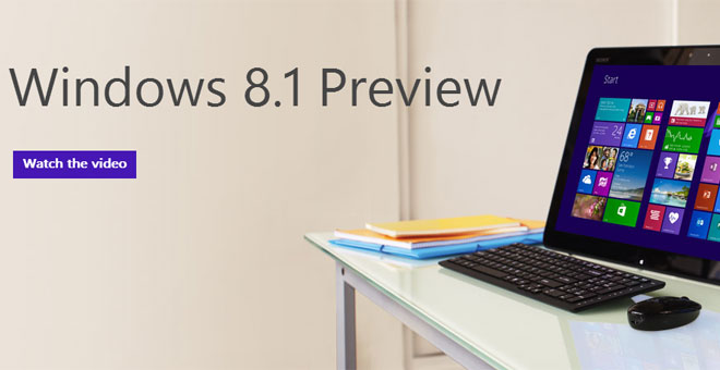
Today at its Build developer conference, Microsoft released the preview of the Windows 8.1 update and it is now available for users to download and try out.

The update brings a lot of changes to Windows 8 in an effort to improve the experience and fix the stuff that people have been complaining about. The major one of them is the removal of the Start button in Windows 8. Happily, it’s back in Windows 8.1 However, there’s no Start menu to go with it, as Microsoft is keeping its new Metro-styled user interface in the new start screen.

The other major update that Windows 8.1 brings is the ability to boot directly to the desktop, rather than the Start Menu. Speaking of the Start Menu, the tiles there now support more sizes: the larger the tile, the more information it holds – just like on Windows Phone 8. Swiping up on the Start Menu unveils all installed applications.

The backgrounds on the Start Menu are now dynamic and allow you to fiddle with them a lot more than before to get them just right according to your taste.

Windows 8.1 also gives you better control over how app windows are snapped and now supports 50/50 split view among the defaults, but will also allow you to define your own percentages for even more control over the personalization. Windows 8 apps now get support for multiple monitor setups, too.

Microsoft has updated some of its core Windows 8 apps and added more features to them. Internet Explorer 11 now supports WebGL, while the Mail app has a more polished user interface that makes it a bit better than before. The same treatment has been given to Xbox Music as well.

Here’s a promo video of the Windows 8.1 update.

Steve Ballmer was proud to state on the stage today that the 3-year update cycle is a thing of the past now. Steve Ballmer reiterated that from now on Microsoft will release updates more swiftly, so the future of Windows is going to be exciting, that’s for sure!

So, if you’re running Windows 8, wait no further and head over to the source link below to download the Windows 8.1 update.


Source : blog[dot]gsmarena[dot]com
Microsoft’s BUILD conference has started, watch the livestream here

It’s been a busy month and it’s not over yet – Microsoft is kicking off its BUILD conference to talk about the future of Windows, Windows Server, Windows Azure, Visual Studio, and more. It should come as no surprise that Windows 8.1 will be a hot topic at the conference but there will be some Windows Phone talk too (about app development, not new features and certainly no GDR3 update).

The Day 1 keynote is minutes away from starting and you can watch it after the break.
After that there’s a half hour break and multiple sessions will cover a variety of subjects. Several presentations will be going on simultaneously during each session, so you’ll have to pick which one you want to watch live. The recordings of all sessions will be uploaded for later viewing, of course.

BUILD spans multiple days (each kicking off with a keynote) and will cover developing apps for Windows 8.1, Windows Phone 8, Azure and so on. Nokia will have a couple presentations: Building a camera app and Bringing Nokia Music from WP8 to Windows 8. There’s a good deal more, here’s the full schedule.


Source : blog[dot]gsmarena[dot]com