Pages

Showing posts with label interface. Show all posts

Nov 14, 2012

Facebook rolls out the share button to mobile users

Designed to encourage mobile users to share more types of content with their friends, Facebook is rolling out a new share button for the mobile interface.

Detailed by Techcrunch earlier today, Facebook has launched a share button on the mobile version of the social network and is planning to add sharing capabilities to both the iOS and Android applications at a later date. While the ability to share a particular article, video or picture is commonplace on the Web version of Facebook, mobile users can simply tap on the new share link in order to pass along an interesting piece of content to their friends. When a user brings up the mobile version of the social network, they will notice a new Share button to the right of the Like and Comment buttons. 
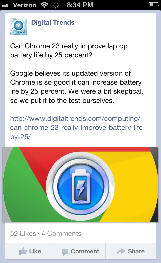
Tapping the new share button brings up an interface that allows the user to write a comment that goes along with the shared content. In addition, the user can isolate the post to a specific subset of their friends through groups or post it publicly in order to reach all subscribers.

Once the user is satisfied with the post, they confirm the sharing action by tapping the Share button in the top right corner of the screen. Alternatively, cancelling the post returns the user to the news feed. The new share button is only appearing within the News feed at this point. When visiting a personal page of a friend or a brand, the share button hasn’t been incorporated within the design yet.

The launch of the new sharing feature marks a trend in Facebook’s strategic approach to mobile. While the inclusion of the sharing button isn’t a technical achievement by any means, the priority of improving Facebook’s mobile interface is evident. According to Facebook’s third quarter results, the social network has approximately 600 million active mobile users each month. In addition, about 120 million of those active users check Facebook exclusively through a mobile device. The addition of the share button on the mobile version of the site could result in a spike in the amount of articles, videos and pictures that are shared each day. 

With the addition of the share button for mobile users, this brings Facebook more in line with social network competitor Twitter. On the web version of Twitter, users are encouraged to retweet posts and share them with friends. It will be interesting to see if mobile users on Facebook transition from the Like action to the Share action. Potentially,  it could significantly increase the amount of shared content people find in their News feeds each day and possibly drown out other status updates from friends and family.

However, it could be extremely helpful to brands and advertisers since the share action is more valuable when attempting to spread a particular piece of content. In a related story noted by The Next Web, Facebook is also rolling out a new feed that allows a user to view posts from brands and other pages into a completely separate feed. While posts from those pages will still appear within the News feed, users can visit this page in order to view recent updates only from liked pages.


Source : digitaltrends[dot]com

Oct 18, 2012

Hands on with the Hisense Pulse, the most affordable Google TV box yet

The Hisense Pulse offers Google TV for $100

Don't let the price tag fool you: Hisense's Pulse Google TV box sports a smart TV interface that is clean, smooth, and usable for everything from live TV to Netflix. And at $100, you won’t be able to find a set-top box much cheaper.

Despite the off-brand name, much has been made of Hisense’s Pulse Google TV box. After hearing about its $100 price point and specs, we scratched our collective heads wondering what the catch was. Well, after some hands-on time with the Pulse, suffice it to say that our heads are still feeling itchy.

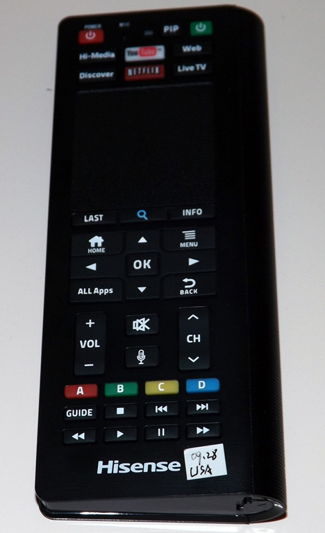
The front side of the remote for Hisense's Pulse Google TV boxWhen we finally got the dual-sided QWERTY keyboard remote in our hands, we expected a herky-jerky, hiccup-prone experience; but what we got was a smooth, responsive version of Hisense’s SmartHub UI, the same interface built into Hisense’s smart TVs. Cycling swiftly through apps like YouTube and Flickster, we wondered aloud how Hisense could afford to offer the Pulse so cheaply. In fact, some of the company’s own employees even confessed that they were as befuddled as we were.

The Pulse simply does not feel like a cheap product, load times are short (slow connection notwithstanding), typing is quick and easy, the trackpad is responsive, and the whole experience felt more or less like browsing the Internet.

Still, if you want to step up the speed and smoothness, the downloadable smartphone app is the way to go. The app (available on Android and iOS) turns your mobile device into a Pulse remote, complete with touch-wheel control and a QWERTY keyboard. Navigating this way feels almost iPod-like, as you swipe your thumb in circles and cycle through content. This method offers ultra-smooth browsing — a bit too smooth for the clumsy thumbed among us.

The back side of the remote for the Hisense Pulse offers a QWERTY keyboard

The Pulse has HDMI, USB, and Ethernet inputs and works with both traditional cable boxes and satellite options. For the former, all it needs is the brand and model number. With those provided, you just hook up the IR blasters (which are included) and you’re ready to go. The Pulse pulls your electronic program guide (EPG) from online, and thus, effectively knows what will be on your TV before you do.

Considering that the typical SmartTV model costs over $100 more than a comparable, less-educated television, we’d have to proclaim the Pulse a solid buy. We were waiting for the other shoe to drop, but for now, the skies seem to be clear. The Pulse will be available in late November, bundled with the remote (originally billed as an add-on) at a suggested price of  $100. 


Source : digitaltrends[dot]com

Sep 25, 2012

Myspace trying to bring SexyBack with new design and functionality

new Myspace landing page

Myspace is overdue for a complete redesign, and while the new interface teases to be quite modern, is it too late for a comeback?

Remember when one of the most popular social networks you used to be on made you rank your friends in a “Top 8″ order? Man, that sucked. Of course, since Facebook’s inception, Myspace has long become abandoned and forgotten by teens, college students, and adults alike — except for those who are trying to promote their music. Oh, yes, music. This is exactly what Myspace has left going for it, and it’s the focus of what the once-reigning social network aims to rebrand itself under according to this teaser video released yesterday of a Pinterest-meets-Windows-8-Metro-UI new design.

As you can see in the clip, Myspace is finally integrating a fuller screen interface with larger blocks of photos, album covers, and status bars. It’s visually more attractive and in tune with today’s web design aesthetics for sure, and still incorporate the use of music in various facets of Myspace functionalities. For example, users will be able to search artists for albums or particular songs, or upload music along with a wall post to their friends. They can also curate playlists and check out the demographics of who’s listening to the tunes.

New myspace wall

“We’re hard at work building the new Myspace, entirely from scratch. But we’re staying true to our roots in one important way – empowering people to express themselves however they want,” Myspace writes in a statement. ”So whether you’re a musician, photographer, filmmaker, designer or just a dedicated fan, we’d love for you to be a part of our brand new community.”

new myspace top fansThe video also comes with a nice little endorsement from the one and only Justin Timberlake, who bought an investment stake in Myspace last year. The teaser video revolves around how artists like JT can search network of friends and media connections, and how fans can feel closer to their favorite musicians by following their status updates and newly uploaded photos.

Interested users can also sign up with Myspace via their other, ahem, more frequently-used social media accounts, such as Facebook and Twitter. Unlike the old Myspace where you have to play songs on individual profiles, a static music bar remains at the bottom of the page so you’re always jamming to your favorite songs.

Is it too little too late for Myspace to make a comeback? All we can say at this point is the use of a spinning vinyl on the current teaser landing page is more than an appropriate symbolism for something that’s long abandoned, forgotten, but can still be pretty cool if you let it — emphasis on the if.

There’s no word on when the new Myspace will launch, but those interested in being the first to jump back on the wagon can put themselves on an e-mail waiting list at new.myspace.com.

Source : digitaltrends[dot]com

New Myspace redesign: Nothing says cool but unused like vinyls in your teaser

new Myspace landing page

Myspace is overdue for a complete redesign, and while the new interface teases to be quite modern, is it too late for a comeback?

Remember when one of the most popular social networks you used to be on made you rank your friends in a “Top 8″ order? Man, that sucked. Of course, since Facebook’s inception, Myspace has long become abandoned and forgotten by teens, college students, and adults alike — except for those who are trying to promote their music. Oh, yes, music. This is exactly what Myspace has left going for it, and it’s the focus of what the once-reigning social network aims to rebrand itself under according to this teaser video released yesterday of a Pinterest-meets-Windows-8-Metro-UI new design.

As you can see in the clip, Myspace is finally integrating a fuller screen interface with larger blocks of photos, album covers, and status bars. It’s visually more attractive and in tune with today’s web design aesthetics for sure, and still incorporate the use of music in various facets of Myspace functionalities. For example, users will be able to search artists for albums or particular songs, or upload music along with a wall post to their friends. They can also curate playlists and check out the demographics of who’s listening to the tunes.

New myspace wall

“We’re hard at work building the new Myspace, entirely from scratch. But we’re staying true to our roots in one important way – empowering people to express themselves however they want,” Myspace writes in a statement. ”So whether you’re a musician, photographer, filmmaker, designer or just a dedicated fan, we’d love for you to be a part of our brand new community.”

new myspace top fansThe video also comes with a nice little endorsement from the one and only Justin Timberlake, who bought an investment stake in Myspace last year. The teaser video revolves around how artists like JT can search network of friends and media connections, and how fans can feel closer to their favorite musicians by following their status updates and newly uploaded photos.

Interested users can also sign up with Myspace via their other, ahem, more frequently-used social media accounts, such as Facebook and Twitter. Unlike the old Myspace where you have to play songs on individual profiles, a static music bar remains at the bottom of the page so you’re always jamming to your favorite songs.

Is it too little too late for Myspace to make a comeback? All we can say at this point is the use of a spinning vinyl on the current teaser landing page is more than an appropriate symbolism for something that’s long abandoned, forgotten, but can still be pretty cool if you let it. The focus word being if.

There are no words on when the new Myspace will launch, but those interested in being the first to jump back on the wagon can put themselves on an e-mail waiting list at new.myspace.com.


Source : digitaltrends[dot]com

Sep 5, 2012

Windows Phone 8 camera interface to support pinch zooming and third-party addons

Adding pinch-zooming to the camera interface is nothing to shout home about, but the addition of third-party plugins certainly is. All smartphone users have their favorite photo apps, but imagine having them all inside the main camera interface. That’s what the new camera lenses feature on Windows Phone 8 promises.

As Microsoft’s Joe Belfiore demoed today, when you install a new camera-centric app from the Marketplace, it integrates as a sort of a lens, an add-on inside your main camera app. So when you start the camera, you have all the special effects, panoramas and image manipulation tricks, in one place.

I love using all sorts of camera apps on my iPhone. Of course, I have several favorites, and I use them interchangeably. They all do the job of taking pictures just fine, but each comes with its own set of nice little features or filters so I just can’t pick a single all-time favorite. Of those, the standard vanilla camera app on the iPhone is the least feature-rich, but unfortunately, it’s the quickest to launch of all, thanks to the always present lockscreen shortcut.

So Microsoft has achieved something I’ve long thought is quite overdue both on iOS and Android – the capability of enhancing the stock camera app with new features via plugins. Some examples shown on the stage by Joe Belfiore include Bing Vision, CNN’s iReport plugin, a regular Panorama plugin, a Photosynth plugin, which lets you take 360-degree panoramas, or even a plugin, called Blink, which lets snaps multiple portrait shots and automatically suggests the one with best facial expression.


Source : blog[dot]gsmarena[dot]com

Aug 27, 2012

Twitter becomes more secretive about where tweets originate

twitter

While Twitter management wants to emphasize content more, Twitter users may get suckered into clicking on more advertising links.

Quietly rolling out a change to the user interface, developers at Twitter have removed the text that indicates which third party application was used when posting a new tweet. Prior to the change, users would see the name of the third party tool, like Seesmic, posted next to the time elapsed since the tweet was published. Prior to the removal of this information on the Web version of Twitter, this change was made on the mobile version of Twitter and a spokesperson for Twitter told Venturebeat “This is part of our work to simplify tweets and emphasize the content being shared.“

Twitter Bird Secret TweetsWhen it comes to celebrity accounts, one downside to this alteration is that it will be more difficult for the average Twitter user to tell the difference between tweets that are original to the celebrity and tweets that have been generated by a team of third party, social media handlers. Prior to this change, one clear sign that a tweet probably didn’t originate directly from a popular figure was the notation of a third party application that typically didn’t appear anywhere else in the feed.

In addition, celebrities and other popular figures that sell tweets to advertisers simply don’t have to be involved in the posting process anymore if they choose. For instance, access to the account could be shared with an advertising firm and tweets could be posted from any third party tool without any loyal fans catching on. According to the Associated Press, celebrities can be paid $10,000 or more per tweet or Facebook status update. 

This change also significantly reduces the amount of free advertising given to third party tools like HootSuite. This will ultimately decrease the amount of Twitter users that are exposed to these management tools in addition to making it extremely difficult for a new third party client to become popular. As of late, Twitter has received criticism from developers due to new limitations placed on the Twitter API. Some developers believe that user growth will be limited by the changes and will eventually cause the elimination of third-party clients. 


Source : digitaltrends[dot]com

Aug 17, 2012

Windows 8 version of Skype leaked, shows off its “Modern” styling

An upcoming version of Skype for Windows 8 has leaked showing off an interface optimized for touch interfaces (read: tablets).

It’s styled using the Metro Modern UI, characteristic of the upcoming Microsoft platform.

Some highlights include the ability to pin favorite contacts, as well as use pay-as-you-go and monthly payment options for landlines.

The app runs smoothly and with almost no issues with its updated interface. When chatting with different contacts, the background changes to let you easily identify who you’re talking to.

The app preview is in very polished, so we are hoping to see it released in the very near future.


Source : blog[dot]gsmarena[dot]com